Visualizzazione 1: introduzione
Riferimenti: SoftPython - visualizzazione 1
- visualizza al meglio in

- versione stampabile: clicca qua
- per navigare nelle slide: premere
Esc
Summer School Data Science 2023 - Modulo 1 informatica: Moodle
Docente: David Leoni david.leoni@unitn.it
Esercitatore: Luca Bosotti luca.bosotti@studenti.unitn.it
Perchè Matplotlib?
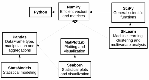
Dalla documentazione di Seaborn:
While you can be productive using only seaborn functions, full customization of your graphics will require some knowledge of matplotlib’s concepts and API.
Un primo grafico
%matplotlib inline è un comando per Jupyter, non Python!!
%matplotlib inline
import matplotlib
import matplotlib.pyplot as plt
import numpy as np
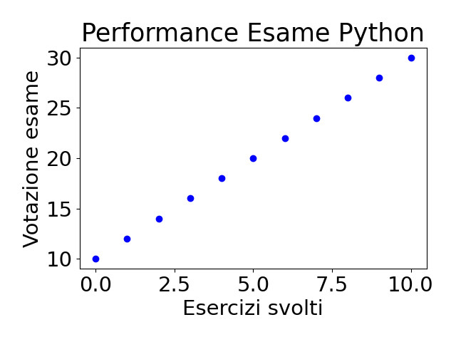
xs = [ 0, 1, 2, 3, 4, 5, 6, 7, 8, 9,10]
ys = [10,12,14,16,18,20,22,24,26,28,30]
plt.plot(xs, ys, 'bo') # b: blue o: pallini
plt.title('Performance Attesa Esame Python')
plt.xlabel('Esercizi svolti')
plt.ylabel('Votazione esame')
# per evitare comparsa di schifezze
plt.show()
|
|
Numpy style
%matplotlib inline
import matplotlib
import matplotlib.pyplot as plt
import numpy as np

xs = np.arange(0, 11, 1.)
ys = 2*xs + 10

# b: blue o: pallini
plt.plot(xs, ys, 'bo')
plt.title('Performance Attesa Esame Python')
plt.xlabel('Esercizi svolti')
plt.ylabel('Votazione esame')

plt.show()
|

|
Personalizziamo
%matplotlib inline
import matplotlib
import matplotlib.pyplot as plt
# 8 x 7 pollici
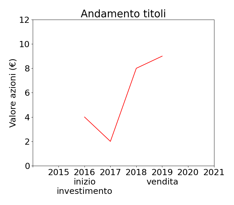
plt.figure( figsize=(8,7) )
xs = [2016, 2017, 2018, 2019]
ys = [ 4, 2, 8, 9]
plt.title('Andamento titoli')
plt.ylabel('Valore azioni (€)')
# r: red -: tratto
plt.plot(xs, ys, 'r-')
# limiti personalizzati
plt.xlim(2014,2021)
plt.ylim(0,12)
dove = [2014,2015,2016, 2017, 2018, 2019,2020,2021]
etichette = ["", "2015", "2016\ninizio\ninvestimento", "2017", "2018", "2019\nvendita", "2020", "2021"]
plt.xticks(dove, etichette)
plt.show()
|
|
Grafici in sovraimpressione
%matplotlib inline
import matplotlib.pyplot as plt
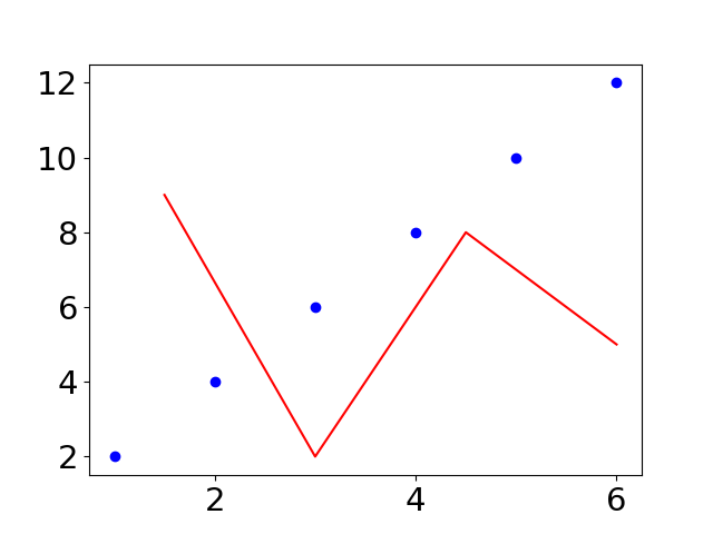
xsa = [1, 2, 3, 4, 5, 6]
ysa = [2, 4, 6, 8,10,12]
plt.plot(xsa, ysa, 'bo')
xsb = [1.5, 3.0, 4.5, 6.0]
ysb = [ 9, 2, 8, 5]
plt.plot(xsb, ysb, 'r-')
plt.show() # UN solo plt.show
|
|
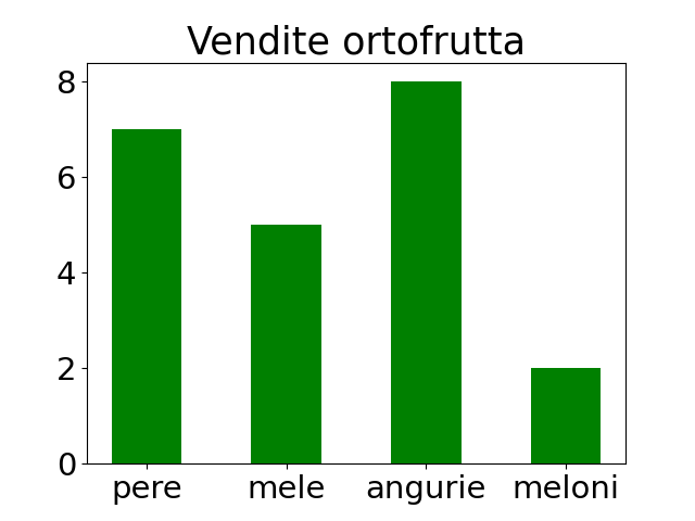
Grafici a barre
import numpy as np
import matplotlib.pyplot as plt

xs = ["pere","mele","angurie","meloni"]
ys = [    7,     5,        8,       2]

plt.title("Vendite ortofrutta")
plt.bar(xs,
        ys,
        0.5,  # larghezza delle barre
        color='green',
        # allinea le barre sull'xtick
        align='center')

plt.show()
|
|
Altri esempi
Nelle slide ho messo esempi dei casi principali che potete trovare all'esame
Per altre cose (in particolare grafici side by side), guardare SoftPython - visualizzazione 1
In [8]: